
A Lesson in Color: The Best Color Combinations for T-Shirts
Originally published on TeeSpy in . Updated .
Whether or not you design your t-shirts yourself, a little color theory goes a long way. Knowing how colors work together can lift a design well beyond the usual.
The good news is that you do not need an art degree. Almost anyone can learn a few color combinations that reliably look good. You will be surprised how much changing a hue or pairing the right colors can transform a shirt.
It is also an easy way to stand out from other sellers, and shoppers do notice. Class is in session!
The Color Wheel
Most color schemes come from the color wheel. The traditional artist’s wheel starts with three primary colors (red, yellow and blue), mixes them into secondary colors (orange, green and violet), then mixes neighbors again into six tertiary colors such as red-orange and blue-green. That gives 12 hues arranged in a circle.
Each scheme below is just a different way of picking hues from that circle.
Six Classic Color Schemes
Monochromatic
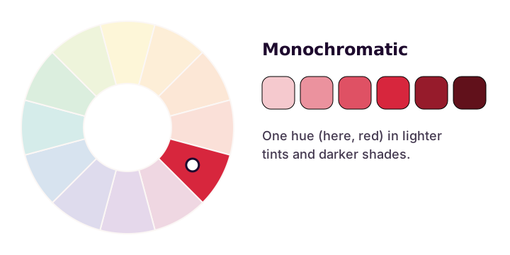
A monochromatic scheme uses a single hue in different strengths: lighter tints (mixed with white) and darker shades (mixed with black). It is hard to get wrong and always looks unified. Even a plain gray scheme can be striking when you use the full range from pale gray to near black.
Complementary
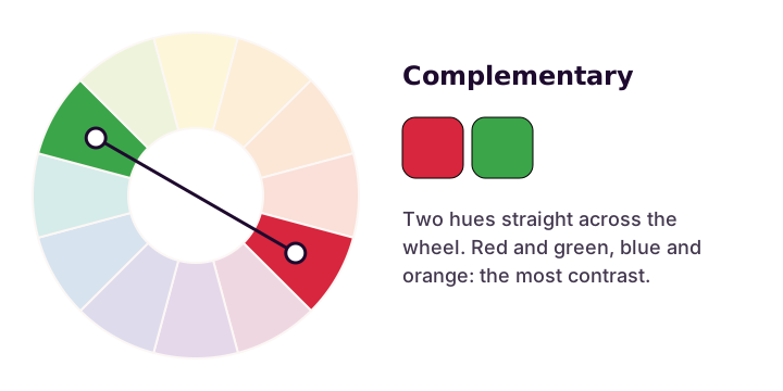
Complementary colors sit directly opposite each other on the wheel: red and green, blue and orange, yellow and violet. Side by side they make each other look brighter, so they grab attention. Used at full strength in equal amounts they can feel loud, so let one color lead and use the other as an accent.
Split-Complementary
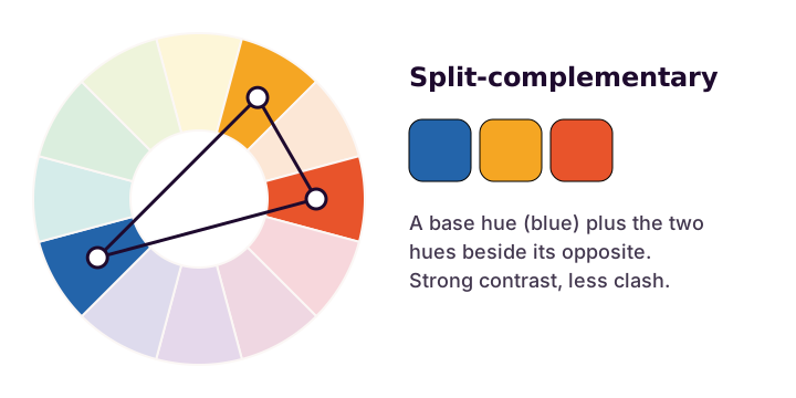
A split-complementary scheme takes one base color, then instead of its exact opposite uses the two colors on either side of that opposite. Blue with yellow-orange and red-orange is a classic example. You still get strong contrast, with less tension than a straight complementary pair, which makes it a safe choice for beginners.
Double Complementary
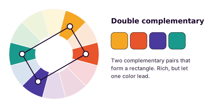
A double complementary (or tetradic) scheme uses two complementary pairs, which form a rectangle on the wheel. It gives you the most variety of any scheme here, so it is the easiest to overdo. Pick one dominant color and keep the other three in supporting roles.
Analogous
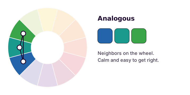
Analogous colors are neighbors on the wheel, usually three in a row, such as blue, blue-green and green. They feel calm and natural because they share undertones. Unlike monochromatic schemes, they give you more than one hue to work with, while still being easy to keep in harmony.
Triadic
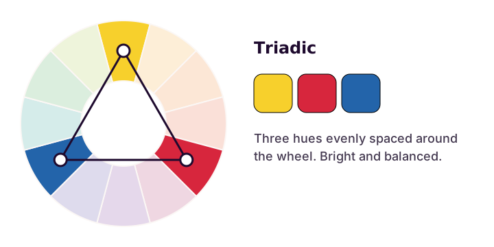
A triadic scheme uses three hues evenly spaced around the wheel, forming a triangle. The primary colors (red, yellow and blue) are the most famous triad. Triads feel bright, playful and balanced, which suits fun or retro designs.
Combining Colors Effectively
If you go too avant-garde, it is not the end of the world. Some designers deliberately pick colors that clash to create unease or to provoke.
But even deliberate clashes can fall flat. If people do not like how the colors look together, they will not want to wear them. There is a fine line between making a statement and making a shirt nobody picks up. These best practices will keep you on the right side of it.
1. Let One Color Lead
Picking the wildest colors you can find is a fun art project, but it rarely makes a shirt people want to wear. However creative you get, build around one main color. Everything else should support it. That gives the design cohesion, and it is quicker than trying to balance a whole palette from scratch.
2. Keep the Color Count Low
More is not always better. Many shoppers prefer clean designs over busy ones, and the number of colors also affects how the shirt is printed. With screen printing, every color needs its own screen, so each extra color adds cost and setup. Direct-to-garment printing, which most print on demand companies use, has no per-color charge, but fewer colors still tend to read better from a distance.
A good rule of thumb is about four colors or fewer. Remember that the shirt itself is a color too. Your design has to work on the fabric you print it on, so check it on both light and dark garments before you publish.
3. Use Online Palette Tools
Building a palette by hand takes time, and that time is often better spent on other parts of your shop. Online tools speed it up. Adobe Color lets you pick a scheme from the color wheel (including every scheme above) and browse palettes made by other people.
4. Pull a Palette From a Photo
Some tools, such as the Coolors image picker, build a palette from a photo. It is a great way to find colors that already work together and to capture a mood, a season or a nostalgic feeling. You can usually pick the colors from the image yourself, too.
Colors and Styles
Once you are comfortable with a few palettes, you can start using color to signal a style. Start with a base color and notice the feelings or images it brings to mind.
A vintage style uses soft, muted colors with low saturation, like faded mustard, dusty teal and washed-out red. Printing on heather or off-white shirts adds to the worn-in look.
A timeless style leans on neutrals: whites, blacks, creams and beiges, sometimes with warm sepia tones. Darker earth tones work too, though too many greens and browns together can start to look like camouflage.
Steampunk mixes Victorian style with a touch of whimsy. It uses metallic tones, especially copper and brass, set against deep reds, blues and browns. Keep the background colors darker than the metals so the metallic details stand out.
For a comic book or superhero feel, think bold. Bright red, blue and yellow with thick black outlines read as “superhero” even without a particular hero in mind, which is also a good way to stay clear of anyone’s trademark.
Finally, the collegiate look uses deep, rich school colors like navy, forest green, crimson and gold. Pair them with a varsity-style block or slab-serif font and the shirt instantly looks like it belongs on campus.